Working Group II put out their state of the climate for AR5 this March and finally worked out how to communicate climate change.
WHO: The many, many world leading scientific authors of the IPCC – the list is here.
WHAT: Working Group II – the impacts, vulnerability and adaptation group from the IPCC
WHEN: 31 March 2014
WHERE: The IPCC website
TITLE: Climate Change 2014: Impacts, Adaptation, and Vulnerability (open access)
Remember in October 2013, when the first chunk of the IPCC 5th Assessment Report (AR5 for us nerds) was released and I was really snarky about how everyone at the UN speaks a really dense dialect of bureaucrat that almost no-one else can understand and will therefore not bother to read?
Well this time the IPCC got it right! The report from Working Group II who look at the impacts, vulnerability and adaptation humanity will have to do because of climate change discovered colours and infographics and language that normal people actually speak and then used it in their summary for policy makers. They even improved the website to make it more user friendly. Round of applause to the IPCC, the UN Foundation and all the communicators who probably spent many hours de-wonkifying the scientific and bureaucratic language.
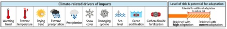
The IPCC discovers colour and images (from paper)
This means my job this week was much easier as I don’t even need to translate the 44-page summary for you, but since it’s 44 pages long, I’ll give you the short version.
This time around, the IPCC deliberately went with a risk management frame for communicating climate impacts, and noted that doing something about climate change isn’t really related to the science, so much as it’s a value judgement on how much we’re willing to roll the dice. They do however helpfully point out that ‘climate change poses risks for human and natural systems’ and that it’s being felt in all countries, on all continents and in all the oceans as well. Sorry to burst your bubble if you thought climate change wasn’t going to get you too.
They even put a glossary up the front so you know what they’re talking about when they use words like ‘hazard’, ‘exposure’, ‘vulnerability’, ‘impacts’, ‘risk’, ‘adaptation’, ‘transformation’ and ‘resilience’. Communication high five, IPCC.
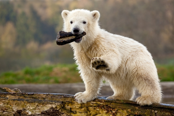
Siku the polar bear (image: Polar Bears International)
Impacts
So what’s happening so far because of climate change then? Well, it’s a long list of nasty stuff; glaciers are melting, there’s drought, the permafrost is melting and releasing methane. Species are being forced out of their habitat faster than they can move and going extinct and the IPCC can report with a high level of confidence that we’re causing climate change extinctions at a much faster rate than has ever happened with previous natural cycles of climate change.
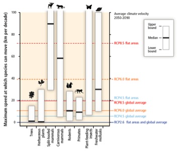
Plant and animal migration opportunities and how far they could get pushed with climate change (from paper)
Crops are getting more negative impacts from climate extremes than the extra CO2 is helping them grow, and the ability to grow lettuce in Greenland will be a coin toss depending on how good the quality of the soil is at such high latitudes. Climate change is already affecting the yield of wheat, maize, rice and soybean crops.
Climate change is affecting (and will continue to affect) humans too – it’s harming our health through heatwave deaths and increased waterborne diseases. It’s a ‘threat multiplier’, which means it makes stressful situations more dire, like the drought in Syria which was a big factor in the current civil war there.
The authors also point out that vulnerabilities differ because of inequality, which is their nice way of saying that if you’re poor or you live in a poor country; climate change will hit you first. This makes sense from what we’re already seeing of climate impacts and clean up from extreme weather disasters – it’s much harder to plan for climate adaptation when you live in a warzone.
Adaptation
After all that depressing news, they follow up with some good news – what we’re doing to adapt to climate change. They point out that adaptation is becoming embedded into planning processes, so areas will be more resilient to changes. Adaptation knowledge is accumulating in both the private and public sectors and is being incorporated into risk management processes.
They do point out though that adaptation and mitigation choices that are made now will affect the severity of climate change for the rest of the century. No pressure or anything, but if we get this wrong all your grandchildren might hate you for it.
Future risks
Then they get into how bad it could get if we do nothing. Low-lying Pacific Islands go underwater (the first one was actually evacuated last weekend), coastal cities get flooded, people die in storms and heatwaves, food runs short in some places, farmers lose their land from drought and desertification and places we are really fond of like the Great Barrier Reef die too.
But even if you don’t care about the plants, animals or people in far away countries, the IPCC isn’t going to let you off the hook. They point out that human influence on the climate system is clear, and it’s the level of danger to humans that we have to manage.
Then they do get a little wonky and come up with a hilarious acronym: RFC which stands for ‘Reasons for Concern’ (bureaucrats have a deep love of acronyms). What are the RFCs and should they be keeping you up at night?
Well it’s your call to lose sleep over it, but you should be worried about losing unique systems (any natural wonder of the world basically), extreme weather, uneven distribution of impacts (even if climate change doesn’t destroy your home city, where do you think all the migrants from the dustbowl will go?), global aggregate impacts (like ocean acidification killing all commercial fisheries), and abrupt irreversible impacts (hello melting Greenland ice sheet!).
Sensibly, they point out that increased warming puts us at a greater risk of ‘severe, pervasive and irreversible impacts’, and that the cost of adapting to all these scary disasters is much cheaper if we mitigate (you know, stop burning carbon).
Sectoral risks
Just in case you still thought that climate change is not going to affect you, your friends and family, your hometown and your favourite holiday location, the IPCC would like to let you know it’s also going to affect your livelihood and your access to food.
We’re going to have more drought and water shortages, could have abrupt change in the Arctic or Amazon rainforest causing all kinds of disruption to not only carbon storage, water quality and biodiversity but also economic activity.
Coastal populations will be threatened by flooding, fisheries could collapse and ocean acidification already caused the loss of $10million worth of scallops in Canada. We’ll probably get more famines thus wiping out all the great work charities have done to try and end world hunger, and if that wasn’t bad enough, the report says ‘all aspects of food security are potentially affected by climate change, including food access, utilisation and price stability’. Everything is going to get more expensive and harder to source.
Cities will have more heat stress, flash flooding, landslides, air pollution, drought and water scarcity (the difference being that drought is when you’re short on water for your garden, water scarcity is when you’re short on water for people). Rural areas will have more food and water insecurity and could lose their farms and livelihoods to drought.
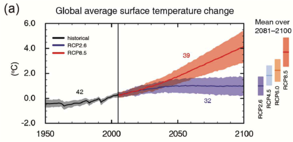
And if that laundry list of destruction wasn’t enough for you, here’s what the IPCC says about their worst case scenario projection (which is what will happen with business as usual): ‘by 2100 for the high-emission scenario RCP 8.5 the combination of high temperatures and humidity in some areas for parts of the year is projected to compromise normal human activities including growing food or working outdoors’.
Yeah, business as usual will make it too hot to go outdoors in some places and you won’t be able to grow any food.
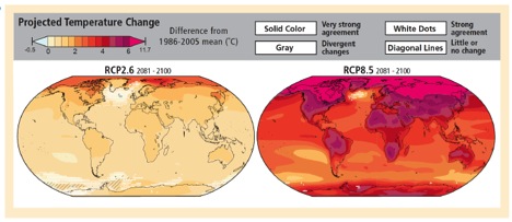
Too hot to go outside – business as usual in 2100 on right (from paper)
Building resilience
So now that the IPCC has told us with high levels of certainty that we’re in big trouble and that climate change is going to affect everyone, no matter how much money you have to still import bacon, coffee and avocados, what can we do about it?
Firstly – coordinate across different levels of government for things like flood proofing and building infrastructure. Use the range of available strategies and actions to make sure communities are reducing their vulnerability – each of the risk bars on the IPCC infographic have a shaded area, which is the amount of risk that can be reduced through adaptation. Make sure planning takes into account diverse interests, circumstances and sociocultural contexts.
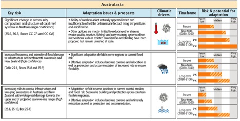
Adaptation risk management opportunities for Australia (from paper)
Some of the really hard conversations around climate change in the future are going to be with communities who will need to relocate or will lose their way of life because of climate impacts. These discussions are both really important and really difficult – we should be planning for that.
The report gives a slight nod to fossil fuel subsides (and the need to remove them) by saying ‘improved resource pricing, charges and subsidies’ which is their way of saying ‘divest, people’.
Also, (and somewhat obviously, but these things need to be said) the success of any adaptation will depend on how much we mitigate. Unless we stop burning carbon, we won’t have anything left we can adapt to – remember, business as usual makes it too hot to go outside and grow food.
So there you have it – the IPCC have kicked a massive goal this time around managing to stop speaking bureaucrat and start communicating with people. Kudos where it is deserved. Working Group III have their report coming out next week, so we’ll see if they can keep up the great work.
In the mean time, let’s stop burning carbon.