What does 100% renewable electricity for the whole of Australia look like?
WHO: The Australian Energy Market Operator, commissioned by the Australian Federal Government
WHAT: Modelling for what a 100% renewable national electricity grid for Australia would look like.
WHEN: July 2013
WHERE: Online at the Department of Climate Change website
TITLE: 100 PER CENT RENEWABLES STUDY – MODELLING OUTCOMES (open access)
The Australian Department of Climate Change (yes, they have one!) commissioned the Australian Energy Market Operator in conjunction with CSIRO and ROAM Consulting to model what a national energy market would look like in 2030 and 2050 with 100% renewable electricity. Oh, and when they say ‘national’ they mean the more densely populated East Coast of the country (sorry WA and NT…)

The ‘national’ energy market (from paper)
They looked at two different scenarios – the first one was rapid deployment of renewable technology with moderate electricity demand growth (ie. including energy efficiency gains), and the second one was moderate deployment of renewable technology with high demand growth (no efficiency gains).
They ran both scenarios for getting our act together by 2030 and procrastinating until 2050 to see what might happen.
Given that this is a government document, it comes with many caveats (of course!). There are uncertainties (always); CSIRO says bioenergy is feasible, other groups say it’s not that feasible. The costs don’t include transitional factors (and change over time), the costs of land acquisition or stranded fossil fuel assets and infrastructure. Phew.
They also pointed out the obvious (someone has to say it I guess) that because this is looking at 100% renewable electricity it does not look at nuclear, natural gas or coal with carbon capture and storage. This is a fossil free zone people!
Ok, so what did they look at? They took data from the 2012 Australian Technology Assessment by the Australian Government Bureau of Resources and Energy Economics, and using that looked at what demand might look like in 2030 and 2050, and calculated the approximate costs.
Their findings in a nutshell are that a renewable system needs more storage (you can’t put solar in a pile like coal to burn later), is a more diverse and distributed system, needs an expanded transmission network and will be primarily driven in Australia by solar.
Depending on when Australia does it, it will cost somewhere between $219billion and $332billion dollars to build. No surprises that it’s cheaper to do it now, not to mention the stranded infrastructure and assets you save by starting the transition now. It’s cheaper after all not to build the coal terminal if you’re only going to use it for a short period of time.
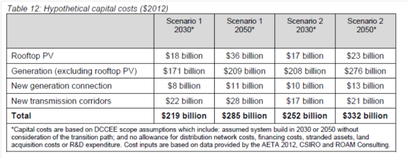
Cost calculations for Scenario 1 (rapid deployment) and Scenario 2 (moderate deployment) (from paper)
They included energy consumption by electric vehicles (EVs) as well as the reduction of demand from rooftop solar. Interestingly, rooftop solar will dramatically change the makeup of a national energy grid. Currently the energy grid is summer peaking, which means more power is used in summer (for things like air conditioners when it’s seriously hot outside). With the uptake of rooftop solar, the grid will become winter peaking, because demand decreases in summer when everyone’s solar panels are doing great.
They ran the numbers to make sure a renewable power grid is as reliable as the current power grid, which is 99.998% reliable, and made sure the technologies they picked are either currently commercially available, or projected to be available soon.
They found that the capital costs are the main factor, given that once renewable power is installed; it costs almost nothing to run, because you don’t have to feed it fossil fuels to go. There are maintenance costs, but all power stations have maintenance costs.
Storage capacity wasn’t found to be economically viable with batteries once scaled up, given that a renewable grid needs 100-130% excess capacity. So storage would be in solar thermal, pumped hydro, biogas or biomass. The paper noted that geothermal (which Australia has a fair bit of) and biomass are similar to current standard baseload power in the way they can be used. Concentrated solar thermal is still a new technology that is being developed, so the scale up potential is not fully known yet, but it’s working well in Spain so far.
The space required to do this (to put the solar panels on and the wind turbines in) is between 2,400 – 5,000km2 which is small change in a country that has 7.7mill km2 and is mostly desert. So people won’t need to worry about wind turbines being put forcibly in their backyards, unless they want them (can I have one? They’re pretty!).
The most economic spread of renewables for transmission costs was a combination of remote with higher transmission costs and local with lower energy generation capacity.
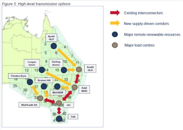
Transmission possibilities (from paper)
The sticking point was meeting evening demand – when everyone comes home from work and turns the lights on and starts cooking dinner and plugs in their EV in the garage. The paper pointed out that work-based charging stations could promote charging your car during the day, but also ran scenarios where the demand shortfall could be met by biogas. This also applied for weeks where the storage capacity of the renewables was low (a week of low wind or a week of overcast weather).

Meeting demand shortfall by dispatching biogas and biomass (from paper)
Long story short, the future is hybrid renewable systems.

Breakdown of each technology for the different scenarios (from paper)
There is no single technology that can replace the energy density of fossil fuels, but a hybrid grid can. Diversifying both the technology and geography of the power grid will not only allow for 100% renewable generation, it will also build resilience.
As climate change extreme weather events become more common, having a distributed power system will avoid mass blackouts. It will be better for everyone’s health (living near a coal mine or a coal power station is NOT good for your health) and it will slow the rate at which we’re cooking the planet. Sounds good to me.